Pricing pages are the unsung heroes of a B2B SaaS website. They often receive as much—if not more—traffic than the homepage, serving as a make-or-break point for potential buyers. Yet, research reveals that 46% of B2B SaaS pricing pages fail the skimmability test, costing businesses critical sales opportunities.
Why Skimmability Matters
Today’s B2B buyers demand efficiency. When visiting a pricing page, they’re likely on the verge of making a decision. A clear, easily digestible layout can nudge them closer to conversion, while a confusing or overly complex page risks driving them away.
Pricing pages that are hard to skim lead to:
- Increased bounce rates: Visitors leave without engaging.
- Lost trust: Poor design can undermine the perceived quality of your product.
- Fewer conversions: Friction in understanding options discourages commitment.
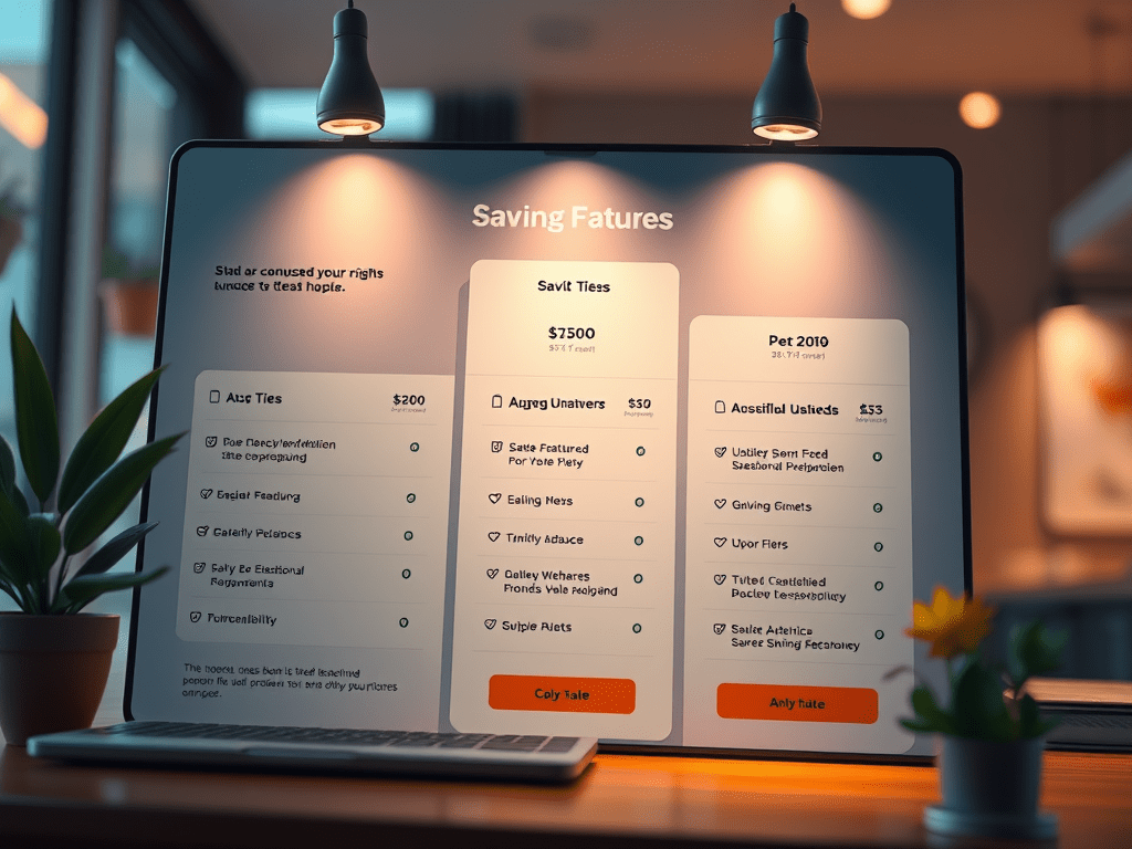
Case in Point: Carbonite’s A/B Test
Carbonite, a data protection and backup SaaS provider, conducted a compelling A/B test on their pricing page that demonstrates the power of skimmability.
The Control: A Skimmability Nightmare
- Four columns overloaded the page, making comparisons difficult.
- 80% of the information was below the fold, requiring extensive scrolling.
- Excessive padding diluted focus and reduced visual clarity.
This design frustrated users, obscuring key details and making decision-making a chore.
The Variant: A Masterclass in Skimmable Design
The redesigned page introduced several strategic improvements:
- Three columns instead of four, simplifying plan comparisons.
- 80% of critical information displayed above the fold, minimising scrolling.
- Compact design, maximising clarity and reducing distractions.
Additional design touches made the variant stand out:
- Strikethrough pricing, creating urgency and highlighting savings.
- Clear table boundaries, helping users visually separate plans and features.
- Easy comparison of three plans, eliminating guesswork.
The results were transformative, proving that skimmability isn’t just about aesthetics—it directly impacts user engagement and conversions.
Is Your Pricing Page Holding You Back?
To assess your own pricing page, consider these questions:
- Can visitors find the key information immediately? Ensure pricing, plan names, and essential features are prominently displayed.
- Is your design compact and structured? Avoid overwhelming users with unnecessary white space or excessive elements.
- Does the layout encourage comparison? Align plans side-by-side for easy evaluation.
- Is the most critical information above the fold? Visitors should grasp your offerings without needing to scroll endlessly.
Failing to prioritise skimmability could be costing you sales.
Take Action
Investing in a well-optimised pricing page is a direct investment in your bottom line. Whether through A/B testing like Carbonite or by consulting design experts, improving skimmability should be a top priority for any B2B SaaS company.
In a competitive market, where buyers compare multiple options in seconds, a skimmable pricing page isn’t optional—it’s essentia